
Introduction
Creating applications that look great on all devices is crucial in modern mobile development. In this comprehensive guide, we'll explore responsive design in React Native and learn how to build user interfaces that adapt seamlessly to different screen sizes.
When building React Native components, we work with various UI properties such as width, height, margin, padding, border radius, and fontSize. However, we face a significant challenge: devices come with vastly different screen resolutions. For example:
- iPhone 12: 1170 x 2532 pixels
- Samsung S23 Ultra: 1440 x 3088 pixels
- iPad Pro 12: 2048 x 2732 pixels
Using fixed sizes for components across all these devices can result in inconsistent layouts and poor user experience. Fortunately, there's an elegant solution to this problem: implementing a responsive scaling system that maintains consistent component proportions across all screen sizes.
Initialization
First, let's create a new React Native project using Expo CLI:
npx create-expo-app@latest --template blank-typescript react-native-responsive-uiStarting the Emulator
Navigate the project directory and launch the emulator, execute the following command:
npx expo startImplementation
To create a responsive UI design, we'll implement a utility class that helps scale our numbers based on the device's screen size. Let's create a responsive.tsx file in the utils folder:
import { Dimensions } from 'react-native';

const { width: deviceWidth, height: deviceHeight } = Dimensions.get('window');

const BaseWidth = 375;

const scale = (size: number) => (deviceWidth / BaseWidth) * size;
const moderateScale = (size: number, factor = 0.5) =>
    size + (scale(size) - size) * factor;

export const responsive = {
    fontSize: (size: number) => moderateScale(size, 1),
    number: (n: number) => moderateScale(n, 1),
    deviceWidth,
    deviceHeight,
};
Our responsive utility provides four essential tools:
- fontSize: Scales font sizes proportionally across different screens
- number: Handles scaling for all other numerical values in style objects
- deviceWidth: Provides the current screen width
- deviceHeight: Provides the current screen height
Let's build a responsive login interface to demonstrate these utilities in action:
import { StatusBar } from 'expo-status-bar';
import { SafeAreaView, Text, View, TextInput, TouchableOpacity } from 'react-native';
import { responsive } from './utils/responsive';

export default function App() {
  return (
    <SafeAreaView style={{
      flex:1,
      backgroundColor:'#121212'}}>

      <View style={{
        flex:1,
        padding: responsive.number(16)
      }}>

        <View style={{
          marginVertical: responsive.number(32),
        }}>
          <Text style={{
            fontSize: responsive.fontSize(28),
            color: '#FFF',
          }}>Welcome back!</Text>

          <Text style={{
            fontSize: responsive.fontSize(16),
            color: '#666666',
            marginTop: responsive.number(4),
          }}>Sign in to continue</Text>
        </View>

        <TextInput style={{
          padding: responsive.number(16),
          backgroundColor:'#1E1E1E',
          fontSize: responsive.fontSize(16),
          borderRadius:responsive.number(12),
          color:'#FFF',
          marginBottom: responsive.number(16),
        }} placeholder={'Email address'} placeholderTextColor={'#666666'}/>

        <TextInput style={{
          padding: responsive.number(16),
          backgroundColor:'#1E1E1E',
          fontSize: responsive.fontSize(16),
          borderRadius:responsive.number(12),
          color:'#FFF',
          marginBottom: responsive.number(16),
        }} placeholder={'Password'} placeholderTextColor={'#666666'}/>

        <TouchableOpacity style={{
          padding: responsive.number(16),
          backgroundColor:'#4A4AFF',
          borderRadius:responsive.number(12),
          marginBottom: responsive.number(16)
        }}>
          <Text style={{
            color: '#FFF',
            fontSize: responsive.fontSize(16),
            textAlign:'center'
          }}>Sign In</Text>
        </TouchableOpacity>

        <Text style={{
          color: '#666666',
          fontSize: responsive.fontSize(14),
          textAlign:'center',
          marginBottom:responsive.number(16)}}>Forgot password?</Text>

        <View style={{
          flexDirection:'row',
          alignSelf:'center'
        }}>
          <Text style={{
            color: '#666666',
            fontSize: responsive.fontSize(14)}}>Don't have an account?</Text>

          <Text style={{
            color: '#FFF',
            fontSize: responsive.fontSize(14),
            marginBottom:responsive.number(16)}}>Create Account</Text>
        </View>
      </View>

      <Text style={{
        color: '#FFF',
        fontSize: responsive.fontSize(14),
        textAlign:'center',
        marginBottom:responsive.number(16)}}> {Math.round(responsive.deviceWidth) + ' x ' + Math.round(responsive.deviceHeight)}</Text>
      <StatusBar style='light'/>
    </SafeAreaView>
  );
}
The login interface demonstrates several responsive design principles:
- Consistent padding and margins using
responsive.number() - Properly scaled font sizes with
responsive.fontSize() - Adaptive border radius and component sizes
- Flexible layout that works across different screen dimensions
As shown in the screenshots below, our interface maintains its proportions and usability across different device sizes:
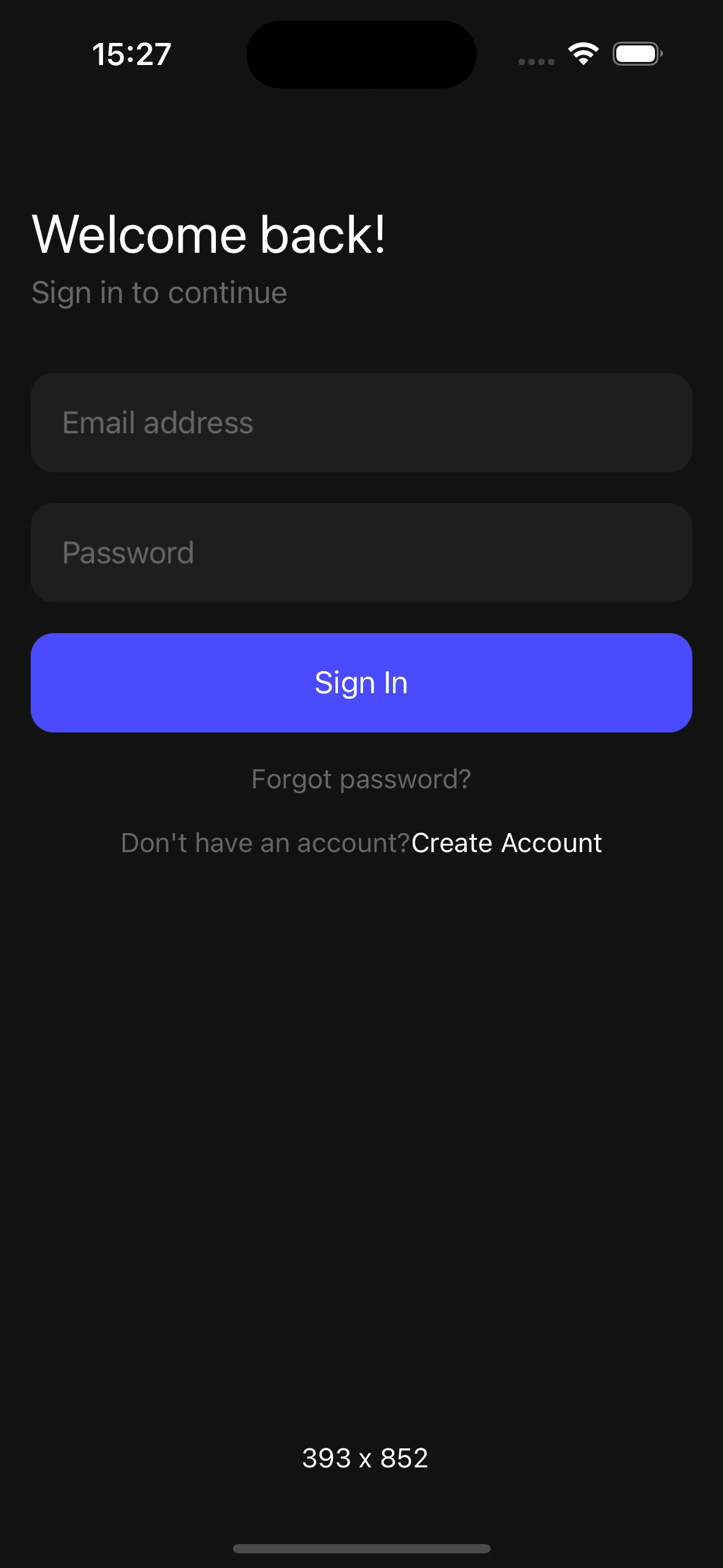
iPhone 16
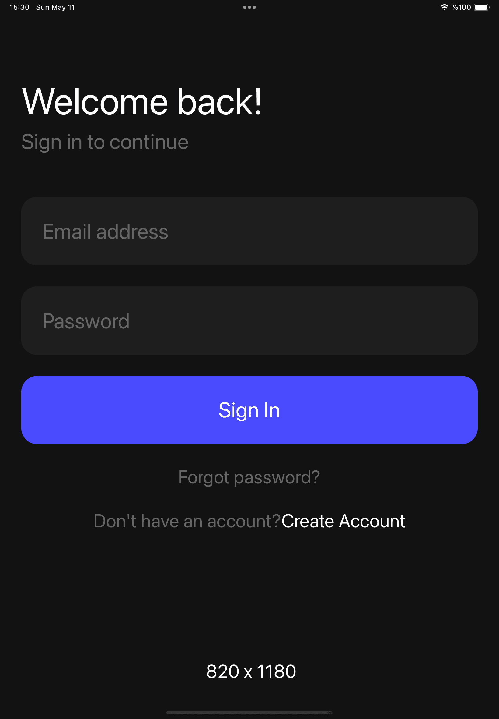
iPad 10th Gen
Source Code
Github Repository LinkProject Dependencies
  "dependencies": {
    "expo": "~53.0.9",
    "expo-status-bar": "~2.2.3",
    "react": "19.0.0",
    "react-native": "0.79.2"
  },
  "devDependencies": {
    "@babel/core": "^7.25.2",
    "@types/react": "~19.0.10",
    "typescript": "~5.8.3"
  }
Conclusion
Implementing responsive design in React Native is essential for creating professional, user-friendly applications that work seamlessly across all devices. Through this tutorial, we've learned how to:
- Create a Responsive Utility: Build a scaling system that adapts to different screen sizes
- Scale UI Elements: Properly scale fonts, padding, margins, and other UI properties
- Maintain Consistency: Keep consistent proportions across different device dimensions
- Implement Practical Solutions: Build a real-world example with a responsive login interface
By following these principles and using the responsive utility we've created, you can ensure your React Native applications look and function great on any device, from small smartphones to large tablets.
Remember to test your responsive layouts on various device sizes and orientations to ensure the best possible user experience. The extra effort in implementing responsive design will significantly improve your app's usability and professional appearance.