
Introduction
In today’s tutorial, we’ll build custom animated toast messages in React Native — ideal for displaying smooth in-app notifications and status alerts. Let’s get started by creating a new React Native project. Open your terminal and run the following command:
Creating Project
npx create-expo-app@latest --template blank-typescript react-native-toast-messageOnce the project is created, navigate to its directory:
cd react-native-toast-messageInstalling Dependencies
For this project, we will use the React Native Reanimated library to add animated fade-in and fade-out effects to our components. Install it with the following command:
npx expo install react-native-reanimatedStarting the Emulator
npx expo startImplementation
We will implement the components separately to ensure reusability and maintain code readability.
Button
Starting with the easy one. Here we made a simple Button component with using Text and TouchableOpacity. There is three props that;
- type: This prop determines the background color of the button and can be set to success, danger, info, or warning.
- text: Use this prop to specify the text displayed on the button.
- onPress: This callback function handles the button press event.
import { Text, TouchableOpacity } from 'react-native';

const Button = ({ type, text, onPress }) => {

    const BUTTON_TYPE = {
      success: {
        backgroundColor: '#2ecc71'
      },
      danger: {
        backgroundColor: '#e74c3c'
      },
      info: {
        backgroundColor: '#3498db'
      },
      warning: {
        backgroundColor: '#f39c12'
      }
    }

    const backgroundColor = BUTTON_TYPE[type].backgroundColor;

    return (
      <TouchableOpacity style={{ width: 250, paddingVertical: 12, justifyContent: 'center', alignItems: 'center', backgroundColor: backgroundColor, borderRadius: 10, marginBottom: 8 }} onPress={onPress}>
        <Text style={{ fontSize: 18, fontWeight: '400', color: '#FFF' }}>{text}</Text>
      </TouchableOpacity>
    )
};

export default Button;
ToastMessage
This component is a bit more complex, so let's break it down. We designed the UI using View, Text, and FontAwesome5 icons.
To achieve the desired animation, we used the Animated.View component and defined the animation behavior with entering and exiting properties.
We will call the showToast method from the parent component, so we need a reference to the object. That's why we define the component with forwardRef and implement the useImperativeHandle method. Inside this method, you'll find the showToast function, which called from parent.
When the showToast method is invoked, it starts a timer and makes the component visible by setting setIsVisible to true.
This component has five properties:
- type: Determines the background color and icon of the component, with options including success, danger, info, and warning.
- text: Specifies the text field of the component.
- description: This property sets the description field of the component.
- timeout: Specifies how many milliseconds the toast notification will remain visible.
- ref: The ref object used to call the showToast function.
import { useState, forwardRef, useImperativeHandle } from 'react';
import { View, Text } from 'react-native';
import Animated, { FadeInUp, FadeOutUp } from 'react-native-reanimated';
import { FontAwesome5 } from '@expo/vector-icons';

export type ToastMessageRef = {
    show: () => void;
};

type ToastMessageProps = {
    type: 'success' | 'danger' | 'info' | 'warning';
    text: string;
    description: string;
    timeout?: number;
};

const ToastMessage = forwardRef<ToastMessageRef, ToastMessageProps>(({ type, text, description, timeout = 1000 }, ref) => {

        const [isVisible, setIsVisible] = useState(false);

        const TOAST_TYPE = {
            success: {
                backgroundColor: '#2ecc71',
                icon: 'check-circle'
            },
            danger: {
                backgroundColor: '#e74c3c',
                icon: 'exclamation-circle'
            },
            info: {
                backgroundColor: '#3498db',
                icon: 'info-circle'
            },
            warning: {
                backgroundColor: '#f39c12',
                icon: 'exclamation-triangle'
            }
        };

        const showToast = () => {
            setIsVisible(true);
            const timer = setTimeout(() => {
                setIsVisible(false);
                clearTimeout(timer);
            }, timeout);
        };

        useImperativeHandle(ref, () => ({
            show: showToast
        }));

        const backgroundColor = TOAST_TYPE[type].backgroundColor;
        const icon = TOAST_TYPE[type].icon;

        return (
            <>
                {isVisible && (
                    <Animated.View
                        style={{
                            position: 'absolute',
                            top: 60,
                            width: '90%',
                            height: 100,
                            backgroundColor: backgroundColor,
                            borderRadius: 10,
                            padding: 12,
                            flexDirection: 'row',
                            alignItems: 'center',
                            shadowColor: '#000',
                            shadowOffset: { width: 0, height: 2 },
                            shadowOpacity: 0.25,
                            shadowRadius: 3.84,
                            elevation: 5
                        }}
                        entering={FadeInUp.delay(200)}
                        exiting={FadeOutUp}
                    >
                        <FontAwesome5 name={icon} size={40} color="#FFF" />
                        <View style={{ marginLeft: 12 }}>
                            <Text style={{ fontSize: 18, fontWeight: '600', color: '#FFF' }}>{text}</Text>
                            <Text style={{ fontSize: 16, fontWeight: '400', color: '#FFF' }}>{description}</Text>
                        </View>
                    </Animated.View>
                )}
            </>
        );
    }
);

export default ToastMessage;
App
Finally, we import and use the Button and ToastMessage components. When the button is pressed, the handleShowToast function is called, which in turn invokes the ToastMessage component using a ref.
import { useRef } from 'react';
import ToastMessage, { ToastMessageRef } from './components/ToastMessage';
import Button from './components/Button';
import { SafeAreaView } from 'react-native';
export default function App() {
const toastRef = useRef<ToastMessageRef>(null);
const handleShowToast = () => {
if (toastRef.current) {
toastRef.current.show();
}
};
return (
<SafeAreaView style={{
flex: 1,
backgroundColor:'#1e272e',
justifyContent: 'center',
alignItems: 'center'
}}>
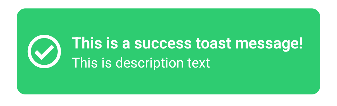
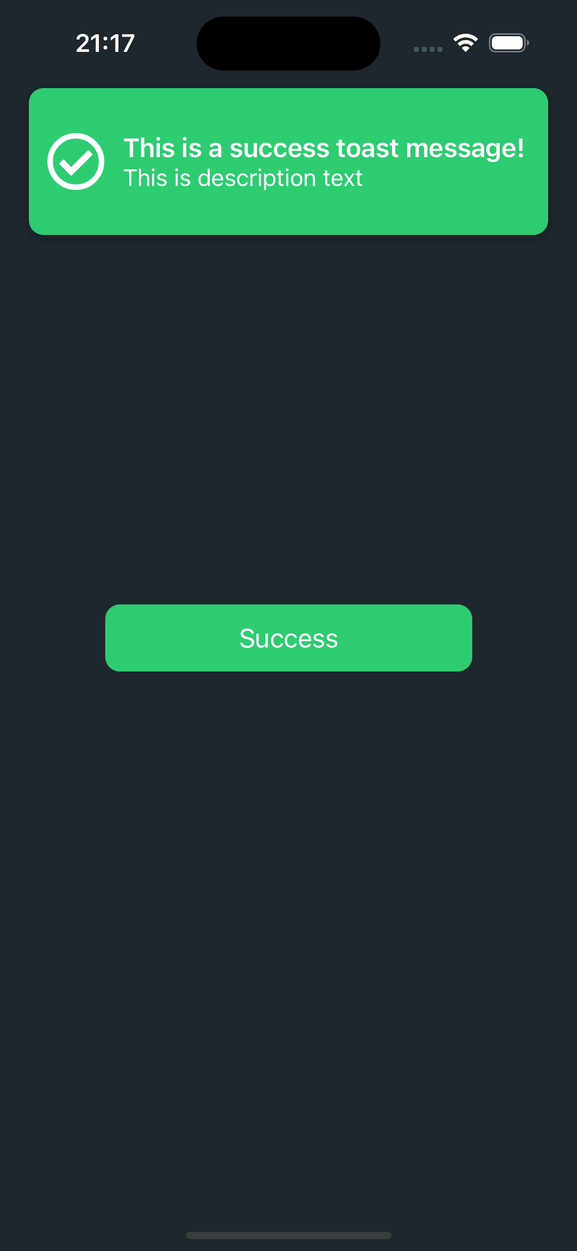
<ToastMessage
type="success"
text="This is a success toast message!"
description="This is description text"
timeout={2000}
ref={toastRef} />
<Button type="success" text="Success" onPress={handleShowToast} />
</SafeAreaView>
);
};
Just update the type property of ToastMessage and Button components. For example;
 <ToastMessage
        type="warning"
        text="This is a warning toast message!"
        description="This is description text"
        timeout={2000}
        ref={toastRef} />

  <Button type="warning" text="Warning" onPress={handleShowToast} />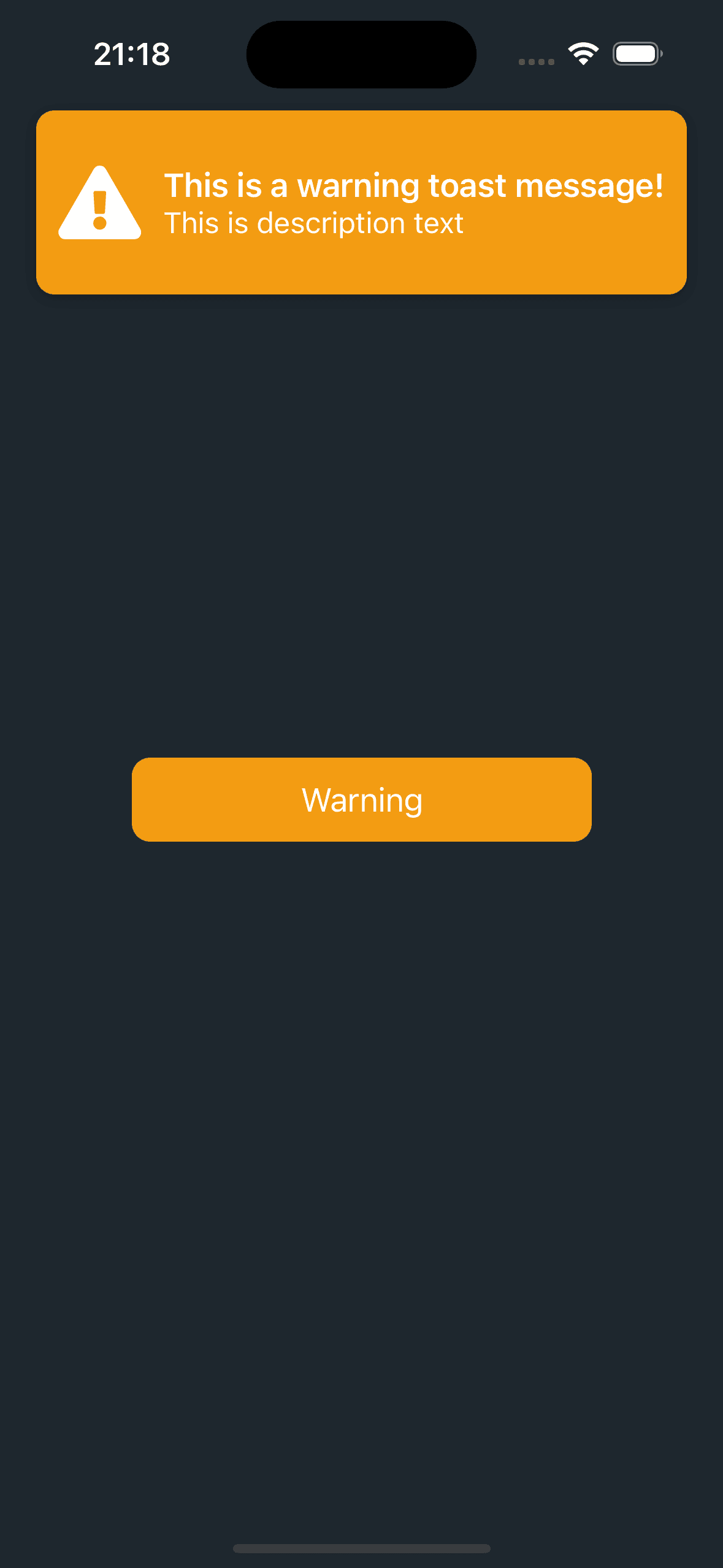
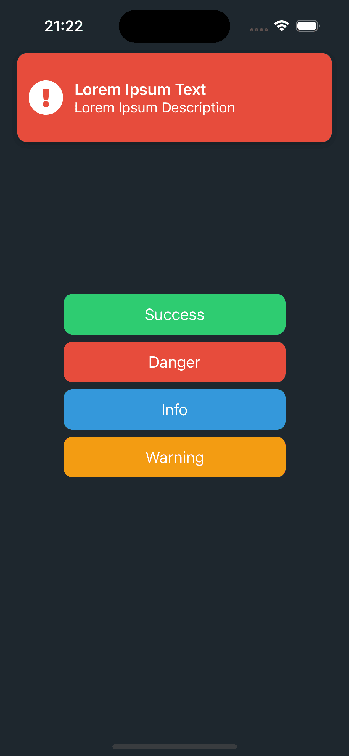
If you want to see all type of Buttons and ToastMessages, change the code like this and enjoy!
import { useRef, useState } from 'react';
import ToastMessage, { ToastMessageRef } from './components/ToastMessage';
import Button from './components/Button';
import { SafeAreaView } from 'react-native';

export default function App() {

  const [toastType, setToastType] = useState<'success' | 'danger' | 'info' | 'warning'>('success');

  const toastRef = useRef<ToastMessageRef>(null);

  const handleShowToast = () => {
    if (toastRef.current) {
      toastRef.current.show();
    }
  };

  return (
      <SafeAreaView style={{
        flex: 1,
        backgroundColor:'#1e272e',
        justifyContent: 'center',
        alignItems: 'center'
      }}>
        <ToastMessage
            type={toastType}
            text='Lorem Ipsum Text'
            description='Lorem Ipsum Description'
            ref={toastRef} />

        <Button type='success' text='Success' onPress={() => { setToastType('success'); handleShowToast(); }} />
        <Button type='danger' text='Danger' onPress={() => { setToastType('danger'); handleShowToast(); }} />
        <Button type='info' text='Info' onPress={() => { setToastType('info'); handleShowToast(); }} />
        <Button type='warning' text='Warning' onPress={() => { setToastType('warning'); handleShowToast(); }} />
      </SafeAreaView>
  );
};
If you have enhancements or ideas for Toast Message, merge requests are welcome!
Source Code
Github Repository LinkProject Dependencies
  "dependencies": {
    "expo": "~53.0.9",
    "expo-status-bar": "~2.2.3",
    "react": "19.0.0",
    "react-native": "0.79.2",
    "react-native-reanimated": "~3.17.4"
  },
  "devDependencies": {
    "@babel/core": "^7.25.2",
    "@types/react": "~19.0.10",
    "typescript": "~5.8.3"
  }
Conclusion
In conclusion, you now have the information and code necessary to implement customized animated toast notificaton messages into your React Native applications. By providing attention-grabbing in-app alerts, you can quickly improve your user experience with the Button and ToastMessage components.