
Introduction
Are you looking to use SVG files as icons in your React Native application? Or perhaps you want to avoid downloading entire icon packs like Font Awesome or Lucide React as dependencies? This comprehensive tutorial will show you how to implement SVG icons efficiently in your React Native projects.
Initialization
npx create-expo-app@latest --template blank-typescript react-native-svg-iconsOnce the project is created, navigate to its directory:
cd react-native-svg-iconsInstalling Dependencies
For this project, we will use the React Native Svg library to render svg files as icon in our react native project. Install it with the following command:
npx expo install react-native-svgWe all installed all dependencies we need, so we can start start the project
Starting the Emulator
npx expo startImplementation
Let's say you want to use Lucide SVG icons. You can find a wide variety of icons at Lucide Icons, one of the best free SVG icon packs available.
Alternatively, you can use FontAwesome Icons, another popular choice among developers.
Select an icon and click the Copy SVG
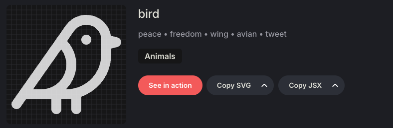
Then navigate the SvgViewer, one of the best tool to convert svg files into react native svg components
Copy the icon svg in the editor, Select React Native and it will automatically convert the svg format to jsx format like this
import * as React from "react";
import Svg, { Path } from "react-native-svg";
const SVGComponent = (props) => (
  <Svg
    xmlns="http://www.w3.org/2000/svg"
    width={24}
    height={24}
    viewBox="0 0 24 24"
    fill="none"
    stroke="currentColor"
    strokeWidth={2}
    strokeLinecap="round"
    strokeLinejoin="round"
    className="lucide lucide-bird-icon lucide-bird"
    {...props}
  >
    <Path d="M16 7h.01" />
    <Path d="M3.4 18H12a8 8 0 0 0 8-8V7a4 4 0 0 0-7.28-2.3L2 20" />
    <Path d="m20 7 2 .5-2 .5" />
    <Path d="M10 18v3" />
    <Path d="M14 17.75V21" />
    <Path d="M7 18a6 6 0 0 0 3.84-10.61" />
  </Svg>
);
export default SVGComponent;
Create a new file Icons.tsx under components/ directory and only move the Svg part to the your Icons.tsx component.
import Svg, { Path, Rect, Circle, Polyline, Line } from 'react-native-svg';

export const Icons = {
    bird: (props: any) => (
        <Svg
            xmlns="http://www.w3.org/2000/svg"
            width={24}
            height={24}
            viewBox="0 0 24 24"
            fill="none"
            stroke="currentColor"
            strokeWidth={2}
            strokeLinecap="round"
            strokeLinejoin="round"
            className="lucide lucide-bird-icon lucide-bird"
            {...props}
        >
            <Path d="M16 7h.01" />
            <Path d="M3.4 18H12a8 8 0 0 0 8-8V7a4 4 0 0 0-7.28-2.3L2 20" />
            <Path d="m20 7 2 .5-2 .5" />
            <Path d="M10 18v3" />
            <Path d="M14 17.75V21" />
            <Path d="M7 18a6 6 0 0 0 3.84-10.61" />
        </Svg>
    ),
}
Now, you can use the svg icon as component in you react native project.
import { StyleSheet, View } from 'react-native';
import {Icons} from './components/Icons';
export default function App() {
return (
<View style={styles.container}>
<Icons.bird/>
</View>
);
}
const styles = StyleSheet.create({
container: {
flex: 1,
backgroundColor: '#fff',
alignItems: 'center',
justifyContent: 'center',
},
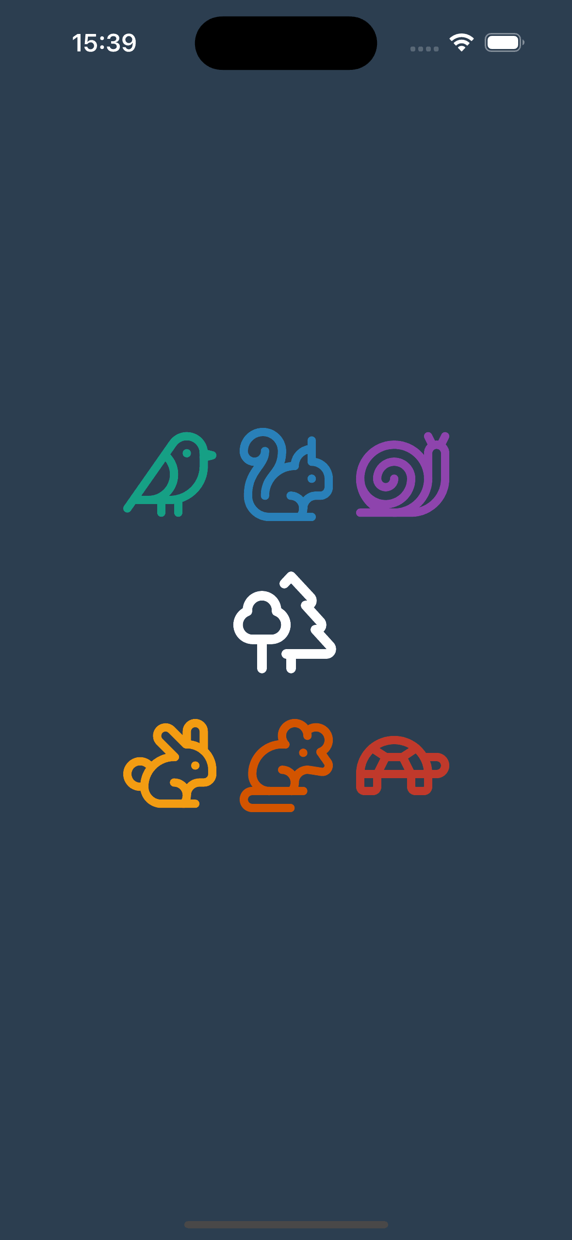
});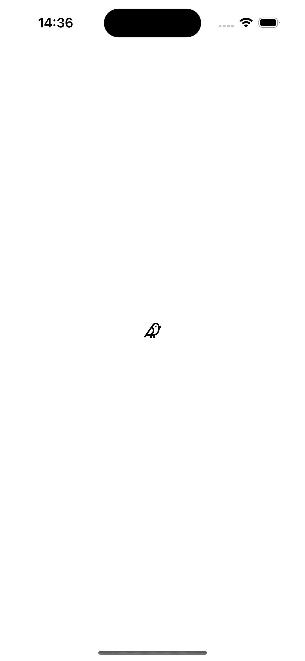
This is very easy to implement and super clean way to manage icons!
In addition you can modify the icon params like width, height, fill, stroke and even style!
import { StyleSheet, View } from 'react-native';
import {Icons} from "./components/Icons";

export default function App() {
  return (
    <View style={styles.container}>
      <Icons.bird/>
      <Icons.bird width={40} height={40} stroke={'#8e44ad'} fill={'#1abc9c'}/>
      <Icons.bird/>
    </View>
  );
}

const styles = StyleSheet.create({
  container: {
    flex: 1,
    flexDirection:'row',
    backgroundColor: '#fff',
    alignItems: 'center',
    justifyContent: 'center',
  },
});
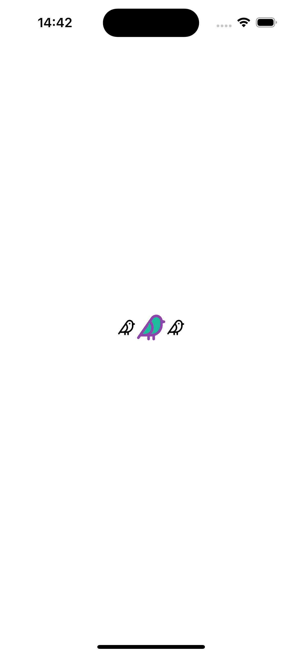
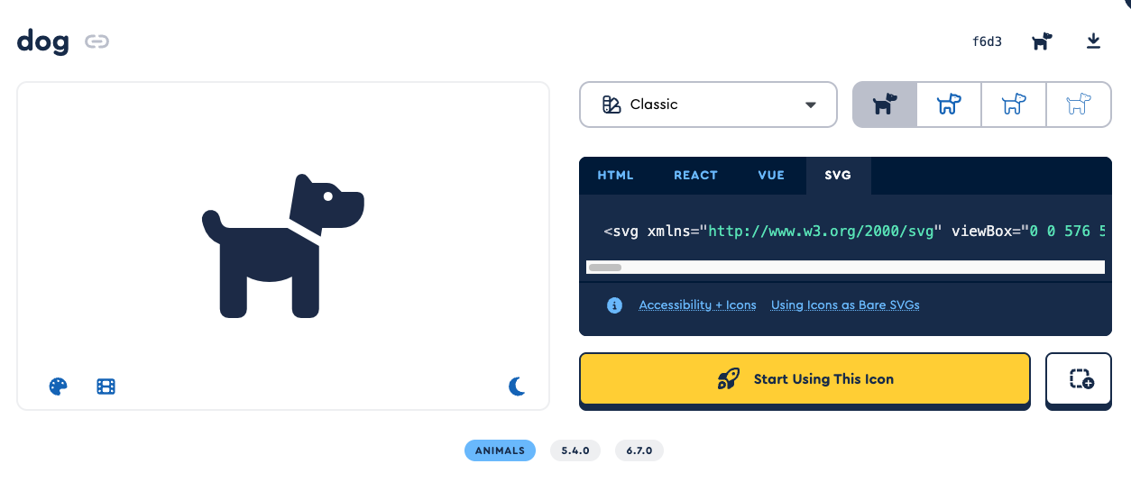
Lets add another svg icon from FontAwesome
Repeat the same process, copy the svg then convert to the react native components
import Svg, { Path, Rect, Circle, Polyline, Line } from 'react-native-svg';

export const Icons = {
    bird: (props: any) => (
        <Svg
            xmlns="http://www.w3.org/2000/svg"
            width={24}
            height={24}
            viewBox="0 0 24 24"
            fill="none"
            stroke="currentColor"
            strokeWidth={2}
            strokeLinecap="round"
            strokeLinejoin="round"
            className="lucide lucide-bird-icon lucide-bird"
            {...props}
        >
            <Path d="M16 7h.01" />
            <Path d="M3.4 18H12a8 8 0 0 0 8-8V7a4 4 0 0 0-7.28-2.3L2 20" />
            <Path d="m20 7 2 .5-2 .5" />
            <Path d="M10 18v3" />
            <Path d="M14 17.75V21" />
            <Path d="M7 18a6 6 0 0 0 3.84-10.61" />
        </Svg>
    ),
    dog: (props: any) => (
        <Svg
            xmlns="http://www.w3.org/2000/svg"
             viewBox="0 0 576 512"
             width={24}
             height={24}
            {...props}>
            <Path d="M309.6 158.5L332.7 19.8C334.6 8.4 344.5 0 356.1 0c7.5 0 14.5 3.5 19 9.5L392 32l52.1 0c12.7 0 24.9 5.1 33.9 14.1L496 64l56 0c13.3 0 24 10.7 24 24l0 24c0 44.2-35.8 80-80 80l-32 0-16 0-21.3 0-5.1 30.5-112-64zM416 256.1L416 480c0 17.7-14.3 32-32 32l-32 0c-17.7 0-32-14.3-32-32l0-115.2c-24 12.3-51.2 19.2-80 19.2s-56-6.9-80-19.2L160 480c0 17.7-14.3 32-32 32l-32 0c-17.7 0-32-14.3-32-32l0-230.2c-28.8-10.9-51.4-35.3-59.2-66.5L1 167.8c-4.3-17.1 6.1-34.5 23.3-38.8s34.5 6.1 38.8 23.3l3.9 15.5C70.5 182 83.3 192 98 192l30 0 16 0 159.8 0L416 256.1zM464 80a16 16 0 1 0 -32 0 16 16 0 1 0 32 0z" />
        </Svg>
    ),
}import { StyleSheet, View } from 'react-native';
import {Icons} from "./components/Icons";
export default function App() {
return (
<View style={styles.container}>
<Icons.dog width={70} height={70}/>
</View>
);
}
const styles = StyleSheet.create({
container: {
flex: 1,
flexDirection:'row',
backgroundColor: '#fff',
alignItems: 'center',
justifyContent: 'center',
},
});
Source Code
Project Dependencies
  "dependencies": {
    "expo": "~53.0.9",
    "expo-status-bar": "~2.2.3",
    "react": "19.0.0",
    "react-native": "0.79.2",
    "react-native-svg": "15.11.2"
  },
  "devDependencies": {
    "@babel/core": "^7.25.2",
    "@types/react": "~19.0.10",
    "typescript": "~5.8.3"
  },
Conclusion
In this tutorial, we've explored how to implement SVG icons in React Native applications using the react-native-svg library. This approach offers several advantages:
- Lightweight: No need to include entire icon libraries
- Customizable: Easy to modify size, color, and other properties
- Scalable: SVGs maintain quality at any size
- Flexible: Mix and match icons from different sources
By following this method, you can create a clean and efficient icon system for your React Native applications. The ability to customize icons on the fly makes this approach particularly valuable for creating dynamic and responsive user interfaces.
Remember to check out the complete source code in the GitHub repository for more examples and implementation details.